Design of Public Posts: Twitter vs Facebook
What design tells you about the company’s values
Both Facebook and Twitter allow posts to be publicly accessible by people who have not joined the platform. It is good to note that the default setting of Facebook is to be private with posts and Twitter to be open to the web. While managing the Facebook and Twitter account of an organization I am involved in, I noticed a serious design pattern involved in displaying the public posts and their stark differences.
Case 1: Stages of interacting with Twitter
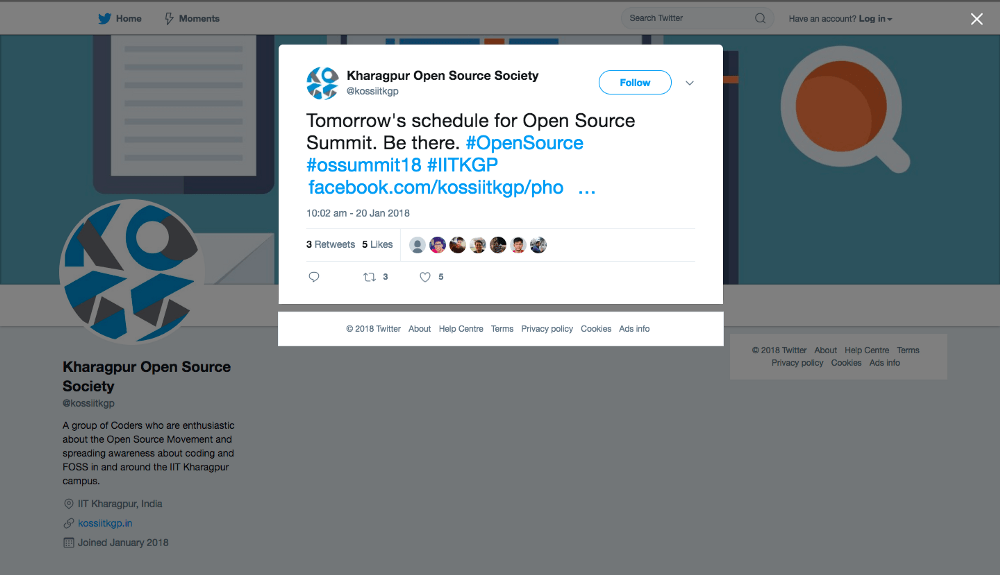
If you open a public tweet in incognito mode, or while being logged out, you’ll land on something like this —
Stage 1 of interaction consists of the content of the tweet with the highest visibility, followed by who created the tweet, then more details about the tweet. At this point of time, there is no available “Sign Up” button to be clicked. You can now easily close the tab since most of the times, your purpose would be the information contained in the tweet.
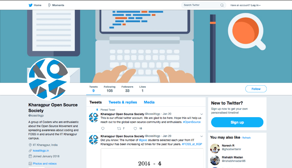
But if you feel engaged and you click on the close button on the top right corner, you’ll land on the profile page of the account which created the tweet, which I call the Stage 2.
You can see that the majority percentage of the web page is covered with the profile information. On the sidebar and header, there are interactive elements which lead you to sign up on the platform. And you would do, if you seem impressed. Let’s have a look at Facebook.
Case 2: Stages of interacting with a public post on Facebook
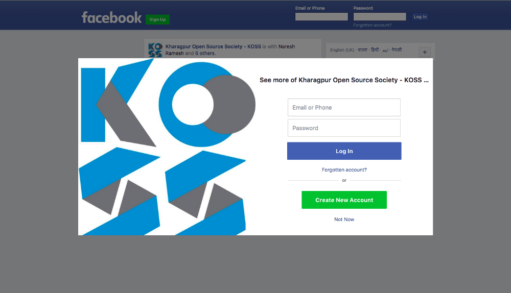
If you open a public post on Facebook, you land on something like this —
It’s interesting to notice that much more than half of the area is covered with ways to either join or log in to Facebook. And the Stage 1 has zero information about the post (which was the sole purpose of opening that particular URL). The only way to close this banner is to find that tiny Not Now text below the big Green Create New Account. An interesting design flaw (whether intentional or by mistake) is that the typography of Not Now and Forgotten Account? is exactly the same, even when the later button is clicked once a hundred times and the former 99 out of 100 times. I think it’s intentional.
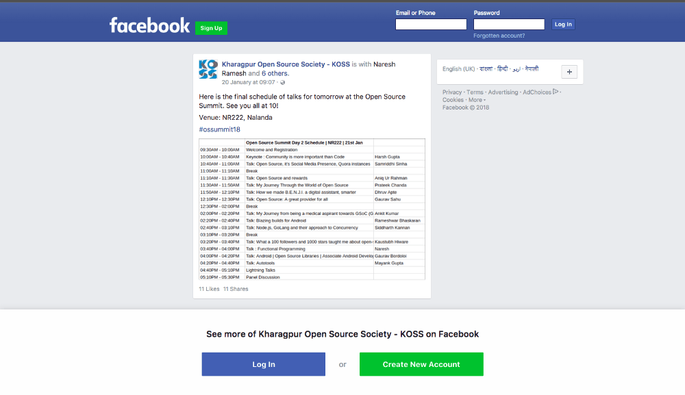
Let’s click on Not Now, and move the Stage 2 of the view.
On this webpage, the area covered with the information about the post is still comparable or maybe less than the engageble area of log in and sign up. It’s funny to note that there are five interactive buttons on this single web page to Join Facebook.
Conclusions:
— Facebook’s main focus is on targeting as many people as they can, while Twitter’s main focus does not appear so. Even if both the products want users, Facebook is desperately user-hungry in public.
— Content is not respected on Facebook while Twitter values the content over anything else. Eventually content dies out on Facebook while people keep retweeting and referring 5 year old tweets.
Thank you for reading. This post is up for suggestions and discussions!


